Northland Design Studies [NDS] - Year 13 Folio Preparation
[Now to be known as Northern College Of The Arts And Technology]
Northland Design Studies is an amazing program. The Year 13 Folio Preparation course gives students the opportunity to develop/further an understanding in Design and Visual Art. NDS allows students seeking Tertiary education to develop an outstanding folio and receive a Certificate IV in their specialised field.
"NDS has been helping to launch art & design student’s careers for well over 20 years."
My experience at NDS [N.C.A.T] has been one of the most joyful and inspirational years of my education. The program has heightened my skill-set and also given me a further understanding in Design and Visual Art. It has strengthened my ambition to be a Designer and gain an occupation within the Creative Industry. There is such a great difference between my work from the start of February to where I am now. I could not have achieved what I have today without this course and the awe-inspiring and amazing staff members. They have always been so supportive and pushed us to do our best.
You all have my many thanks and utmost gratitude, I couldn't have done it without you all.
-insert teary smile-
- -
Contact
62 Murray Road,
Preston East,
Melbourne, Australia
3072
http://www.nds.vic.edu.au
http://ndsfoliopreparation.blogspot.com/

Friday, November 18, 2011
Saturday, November 12, 2011
13 - 12 - 11
"You can search forever;
You can observe forever.
But, you'll never learn,
Unless you question... "

'?'
Side Project
Friday, November 11, 2011
To Be In Awe...
Marc Atlan was one of the first designers that drew my attention to the Design Industry. The stumble was purely accidental; once upon a time when Poketo apparel was easy enough to find on Gertrude St, I came across an aesthetic, chaotic, typography-based printed shirt. The designer was none other than Marc Atlan. After admiring the design for many hours, I chose to research.
"Marc Atlan is a French born creative director based in Los Angeles, California. He is the founder of “Marc Atlan Design, Inc.” where he conceptualizes and produces ad campaigns and catalogues, logos and brand identities, perfume bottles and packagings, magazine designs as well as store displays and installations."
His work varies from photography-based pieces to minimalist approaches to the Bauhaus inspired to sophisticated typography. Atlan is amazing, to say the least. His diversity of the field is awe-inspiring; it's hard to not be even slightly infatuated.
www.marcatlan.com
Atlan's professional website is easy to navigate and represent his minimalist and sophisticated 'nature.' It presents his work with a professional appeal and does not distract his audience from observing his material.
--

It's been 7 years. I still have the said shirt.
Monday, November 7, 2011
The Oh, So, Amazing, Blog-o-sphere
Matheus Lopes Castro or often known as 'Mathiole' is an absolutely amazing illustrator.
The simplicity of his blog layout places emphasis on the stunning nature of his work.
--
Teagan White - "Intricate lines, naturalistic rendering, and subdued color are integral to her visual identity."
And the statement proves true. Teagan White's website adopts all that she is, artistically speaking. Subdued hues and intricate illustrations are scattered through the entirety of this site.
--
Ricardo Fumanal's blog adopts a simplistic grid layout, which presents sophistication and enthrals us to stare at the technicality of his illustrations. The simplicity allows us to get lost in his work and remain undistracted.
Thursday, October 13, 2011

Sunday, September 11, 2011
Update VI
LATEST BRIEF:
Design a poster/fold out pamphlet for one of the exhibitions in the Melbourne Festival.
I have chosen to base my design around "A Different Temporality."


Design a poster/fold out pamphlet for one of the exhibitions in the Melbourne Festival.
I have chosen to base my design around "A Different Temporality."
Presented by Monash University Museum of Art (MUMA) in association with Melbourne Festival
A DIFFERENT TEMPORALITY
Aspects of Australian Feminist Art Practice 1975-1985
"A salute to women who contributed to a ground-breaking decade in Australian art, A Different Temporality considers time as subject and metaphor in Australian feminist art practice from 1975 through to 1985.
A period when women artists were agitating for recognition in the broader Australian art community, this was a remarkable time of change both for women and for Australia as a whole. Politically diverse, A Different Temporality unearths the flash points of a powerfully influential period.
Encompassing time-based media such as performance, photography and film, this exhibition is a provocative series of intrusions from a time of uncommon artistic fecundity."
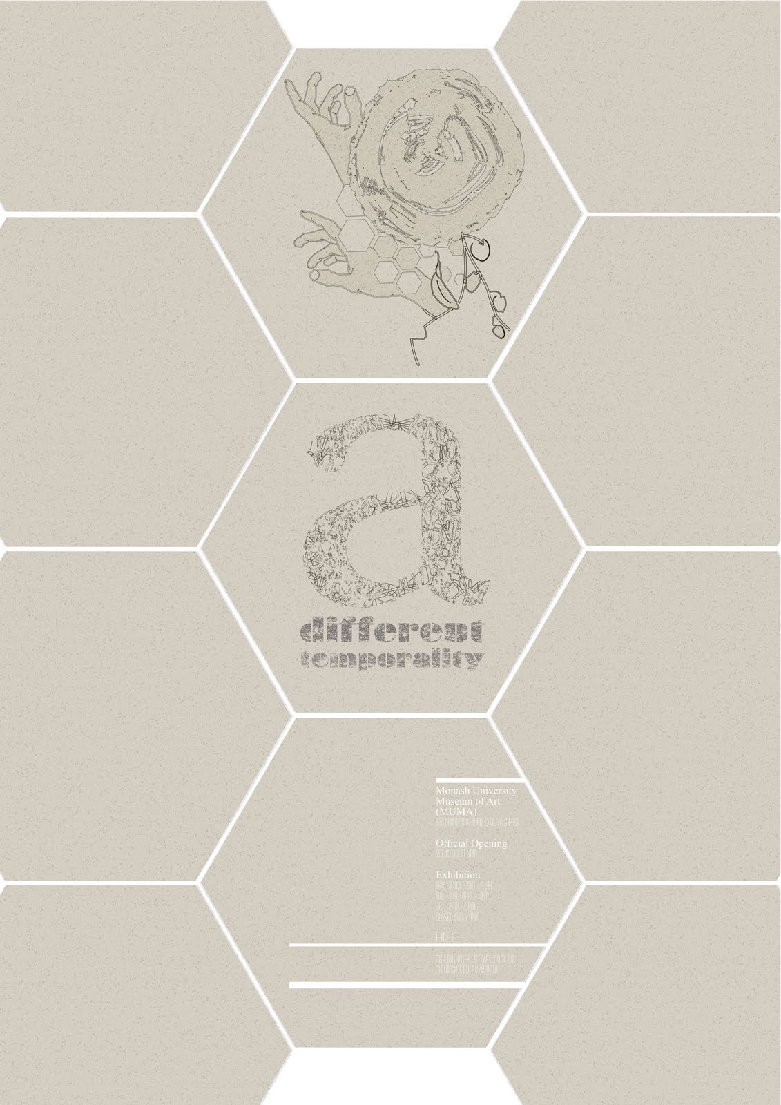
'a different temporality'
[Full Poster Layout]

'a different temporality'
[Close Up]
The close up above depicts the main imagery of the poster.
Each aspect of the visual coincides and intertwines to represent the relationship between what the exhibition intends to represent. My intention was to develop an imagery, which is conceptual in nature. The geometric shapes and hands reflect feminism. The hands represent the belief in equality, the want to reach a desired goal and the geometric shape portray the characteristics of feminism; unity and community. It also represents the want of equality for women.
The organic shape portrays a tree trunk. This is meant to represent 'temporality', considering time is an important concept of the exhibition. The rings of the trunk represent this idea intended.
The leaves and twigs represent 'art.' The way art is expressive, liberating and free flowing.
Friday, August 26, 2011
Update V
BAM!
LATEST BRIEF:

LATEST BRIEF:

[awake since 4 a.m.]
It's a fourteen page InDesign document. The objective of this brief is to design a non-fiction book from a list of titles given.
My book's subject matter is anatomy, going by the title of 'Nexus.'
nexus |ˈneksəs|noun ( pl. same or -uses )a connection or series of connections linking two or more things.
I have explored this brief using a minimalist approach. The purpose of the given title is that it places emphasis on the ideology that anatomy is just a connection of groups and series. The cover itself consists of 5 pages with each letter of the title, with segments of a ribcage/spine (printed on transparency film). This reinforces the concept of connection.
The interior is simplistic in nature, with consistent use of dashed (2pt) line and circles which reinforces the concepts stated above. These graphic elements also link all the pages together.
The book itself has yet to be put together; it's currently in the process of being done so.
A post of the final product, will be posted.
Tuesday, July 12, 2011
Update IV
So, currently all the NDS students are on break; [including myself, obviously. Heh.]
However, this break feels very little like a break; the constant yearns of my acquaintances, leave me sleepless - quite a dramatic verbal interpretation, but trust me when I state things in such a manner; a ridiculous amount of social interaction deserves an over the top comment. Alas, I shall cease with the somewhat sardonic humor.
As you have most likely noted, this 'Update' is not orientating around my course and/or work, but rather, it can be defined as a random, out of the blue... digression? More or less? In trying to understand someone's work, you must also learn of the artist. I am definitely not an artist as of yet, but purely for amusement purposes and some form of gratification, this is purely just a ramble based on any factor that draws forth from my mind.
So, as I stated earlier, I am ridiculously weary. Lethargy is currently at an all time high; slightly melancholic, is it not? I'm attempting getting in my last few days of rest before heading back to NDS, however, I think this will not occur. People seem to have this incessant need of being pervasive and intrusive. Really, it's like mental claustrophobia. I really don't know how to gently tell these people to go away.
But, hey, if anyone reading this, (which is highly doubtful), you should give me suggestions on how to inform others to leave you be in your own contented isolation.

So, above, as you can see, is my current state of apathy and lethargy. I think I have made my point.
Have a nice day.
Monday, June 20, 2011
Update III
Once again, I apologize for the lack of posts. I was on a two week break in Malaysia. Moving on, here is a quick little 'doodle' I was working on whilst stuck in the sweltering heat of Malaysia.

"Te Desidero"
I Miss You.
I was feeling slightly homesick and missing a lovely person.

"Article; Guy Fawkes"
[Imagery + Illustration]
Got a new brief for Illustration. The aim was to develop an illustration that related to an article we received.

Next week, we have Mid-Term Interviews. Here is just a quick snap shot of SOME of the work that is to be in my folio. Crazy, no?
Friday, May 27, 2011
Update II
Just a few things I've been working on as of late.

"a"
3D Typography
[Board, Fake Wood Lino, Copper Chain, Dried Blossum Twig, Acrylic.]
As stated above; the brief assigned was for us to develop a pieace of 3D Typography.


' [&] In Just One Week,"
['so much can change; so much can falter.']
[Watercolor Paper, Board, Marker, Biro, Thread.]
We were to develop a visual representation of one week that passed by. We were to focus on one part of that week and represent in any manner that we wished. I chose to focus on the people and places I saw; the visual component is a 'journal', which includes illustrations and typography.
The following are just a few close up shots of the final.

"Dear"
[Close Up. I.]

"Adam"
[Close Up. II.]

"Mother"
[Close Up. III.]

"Flinders Street Station"
[Close Up. IV.]
Monday, May 23, 2011
Update.
Here are just a few "W.I.P's" of a current brief I'm working on.
The objective of the brief is to design 3 business cards for self promotional purposes.
Here is one of the designs I am currently developing.
Self-Portrait [VECTOR-based]


The objective of the brief is to design 3 business cards for self promotional purposes.
Here is one of the designs I am currently developing.
Self-Portrait [VECTOR-based]


Color Experimentation

Color/Layout Experimentation
Friday, May 6, 2011
Apologies && Overviews.
First off, I'd like to apologize for my lack of posts; [our internet provider decided it would be amusing to sever our internet connection -insert abuse here-]
Moving along; throughout the past three weeks, I have returned to NDS after a two week break. After returning to NDS for a week, I have been given multiple briefs to complete, here are just a few.


'Job Application'
[This brief asks us to apply for a job; imagining where we would be in three years time and presuming we have the qualifications needed for the occupation of our intended career path. We are to write up a covering letter, which is to be submitted with a folio piece.]
I am quite content with the result of my final product. Instead of being bland and 'cliched', I chose to be slightly more creative in this brief. The final product includes a 'Book Box', which I produced using an old book found at a second hand store. The 'Book Box' contains a business card and a small pamphlet, which includes a cover letter and resume; [pages are sewn together]. There is also a four paged A4 portfolio [hand sewn], which includes four designs I developed during my break. Each page is separated with a piece of transparency film.
[Designs in the A4 Portfolio]

[Poster Design]

'Anti-Smoking'
[Poster Design]

'Twitter'
[Advertisement/T-Shirt]

'Typo'
[Advertisement/T-Shirt]
- - - - - - - - -

'Sea'
Expressionist Landscape
[Influenced by the German Expressionists]

'Him'
[Influenced by the 9x5 Exhibition]
(Oils and Acrylics, canvas board)
Done over the two week break.
Wednesday, April 6, 2011
Prefered.
Nine weeks of the course have flown by. Throughout the past nine weeks, many of us have produced several briefs. Here are a collection of a few finals that I have generated throughout this time span, that I favor.

'Greenpeace'
[Greenpeace Advertisement]

'Faces'
[St. Kilda Extended Piece]

'BoAka'
[De Stijl Label Design]
Thursday, March 31, 2011
Designs
Throughout the following weeks, many of us have been given multiple briefs at a time to accomplish.
Here is a design I completed for my Illustrations class. The aim was to develop postcard designs, which evidently portray the opening of an organization/company listed on the assignment sheet.

I chose to generate two designs orientating around a hairdresser/stylist [www.rokkebony.com]. Two extra designs were completed on the side; (one a tea emporium [T2] and the other being a Millinery Boutique.)
Tuesday, March 8, 2011
Excursion.
On the 25th February all of us NDS students went on an excursion into the city. The aim of the excursion was to gain stock images for our work throughout the year.
Our group got the opportunity to wander Gertrude and Brunswick Street.
I stumbled upon "panelpop" which, is amazing to say the least.
Given the fact we were assigned to take 60 pictures; through selecting several images we had taken, we are to design a pattern from them.
Here is the design I have created.

Thursday, February 24, 2011
Two Weeks

Studio Drawing [Sign Pen]


Life Drawing [Willow Charcoal]
Throughout the past two weeks, many of us have experimented with different mediums that we we're not familiar/comfortable with. During the two weeks many of us students have gained some form of 'confidence' using these 'new' mediums. I myself feel as though I have progressed in some way or form. Above are just the few pieces that I have accomplished during this short period of time.
Sunday, February 13, 2011
Boy In Static

Audrey Kawaski
Oil & Graphite on wood panel. 8'x6'
Kawaski's work holds manga inspired influences and portrays an Art Nouveau-like-atmosphere.
Her figures have commonly been described as seductive and attractive, but can often be depicted as disturbing and cynical.
Kawaski uses the natural grain of the wood panels she paints on to give her work a sense of atmosphere and to giver her work a sense of 'warmth' to contrast with the 'cold' appeal of her figures.
Personally, it's quite enjoyable to gaze at her work. Kawaski's paintings influence a conflict of emotions. It's intriguing and rather desirable.
Subscribe to:
Comments (Atom)